Prism Gallery
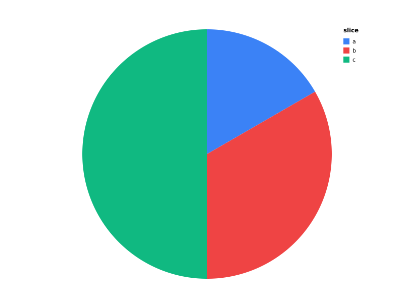
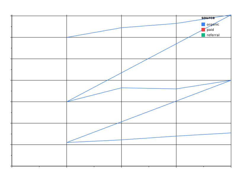
129 fixture specs across 18 categories. Each entry pairs a *.prism.json
spec with a rendered *.svg. Browse the source to learn the spec
shapes; open the SVGs to see what they render. The table/ fixtures
are one exception — a top-level table mark renders only through
the html backend, so those entries link to a rendered *.html file
instead of an <img> preview. The Custom marks
section is the other exception, and has no *.prism.json at all — see
that section for why.
For live interactive rendering in a browser, see live.html.
Basic marks






Composite marks


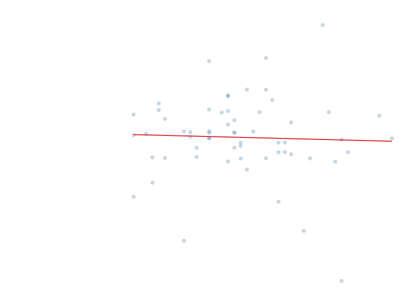
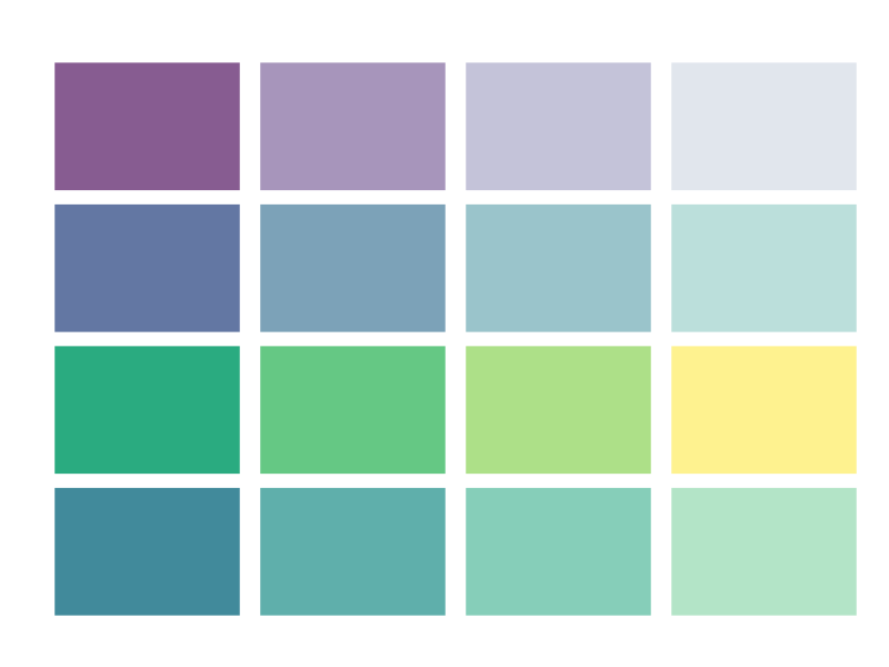
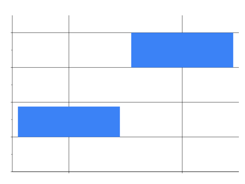
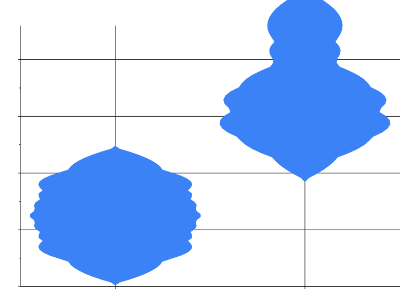
Specialty marks


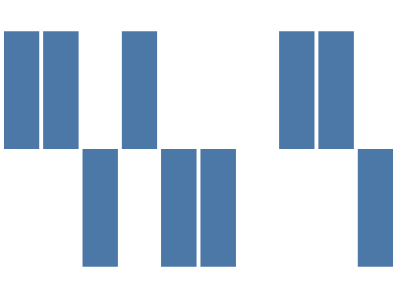





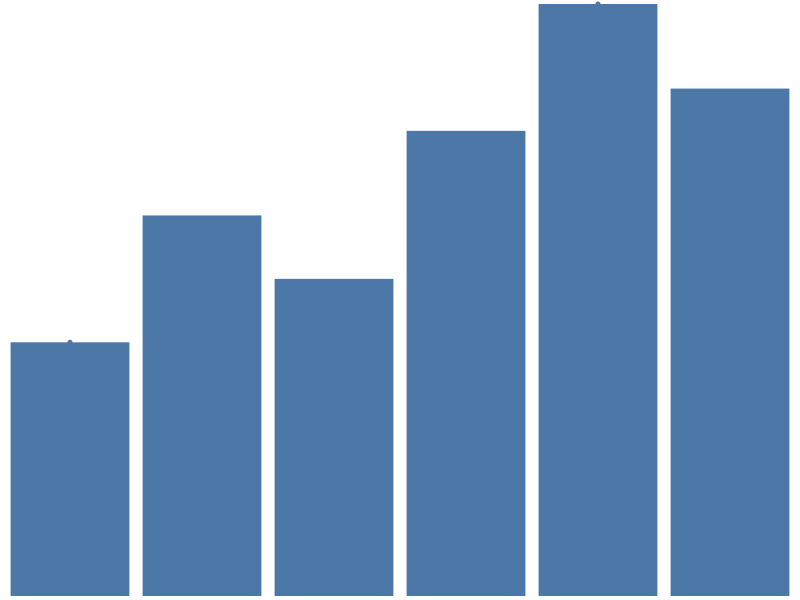

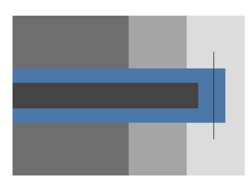
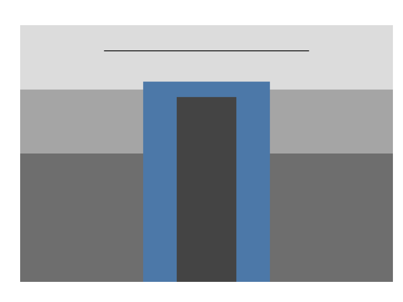



Progress
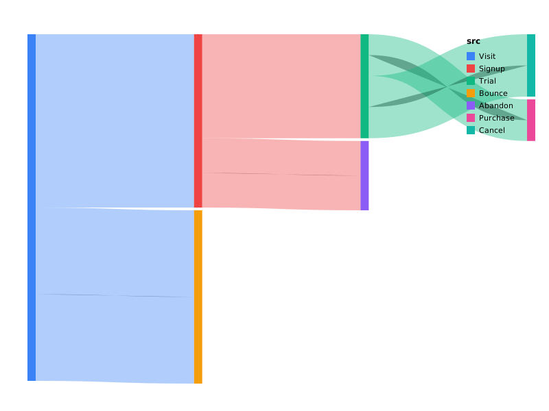
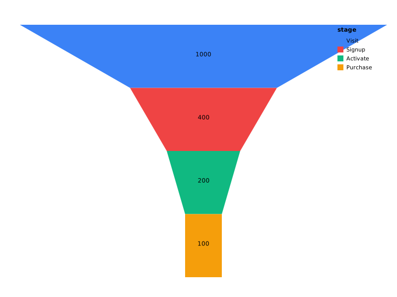
One value bar per data row on a full-scale track — the multi-row
sibling of bullet. See Marks ›
Progress.
| Spec | Preview |
|---|---|
| progress_brand_funnel | 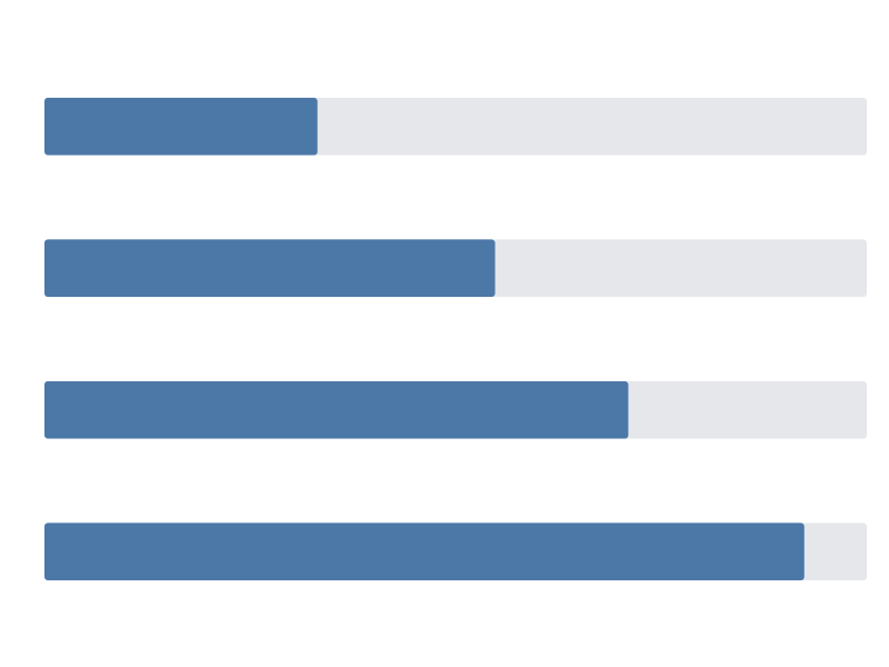 |
| progress_metric_row | 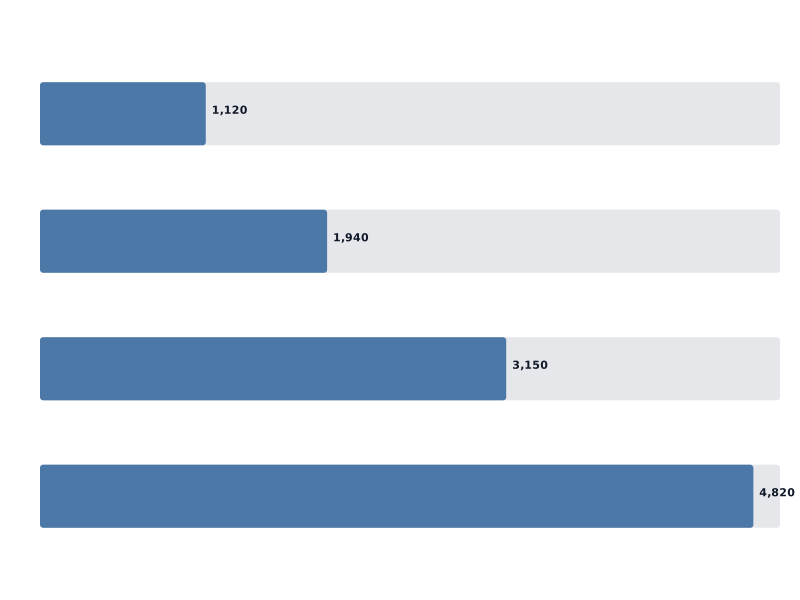 |
| progress_team_quota | 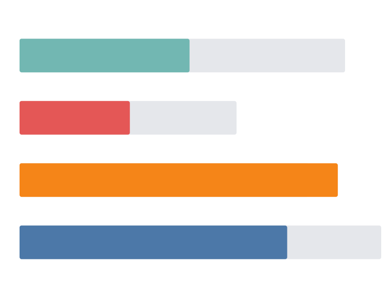 |
| progress_vertical_capacity | 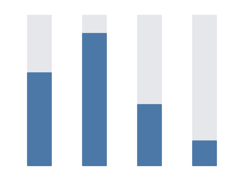 |
Geographic marks
| Spec | Preview |
|---|---|
| world_basic | 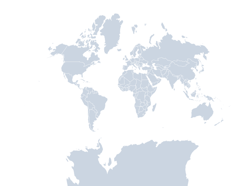 |
| world_choropleth | 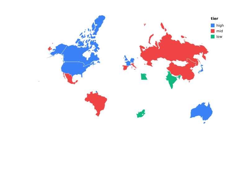 |
| usa_states | 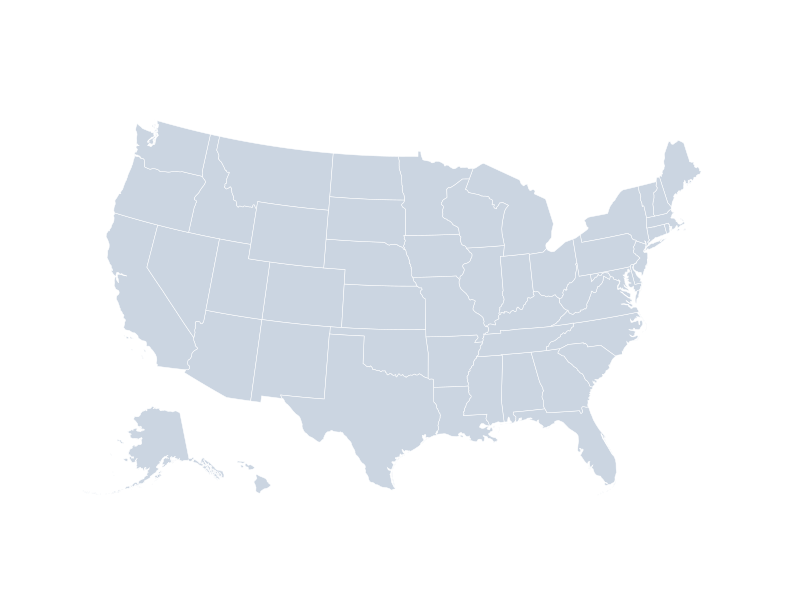 |
Table
The table mark renders as an interactive, paginated HTML <table> —
not SVG geometry — so these fixtures link to a rendered *.html file
rather than showing an <img> preview. See Marks ›
Table.
| Spec | Preview |
|---|---|
| table_accounts | table_accounts.html — plain columns, paginated (page_size: 5 over 7 rows) |
| table_revenue_trend | table_revenue_trend.html — a sparkline sub-mark column |
Custom marks
A custom mark (mark: {"type": "custom", "renderer": "…"}) resolves
its renderer name against a Go-level registry (custommark.Register)
at render time — a mechanism only a caller-supplied binary can
exercise, not the shared prism CLI, which has nothing registered
under any name. That means these two fixtures have no
*.prism.json companion (unlike every other category on this page,
table/ included): a spec referencing quote-card or stat-card
cannot be plotted by prism plot as committed. See Cookbook › Custom
marks: Why no gallery *.prism.json for these
two
for the full explanation, the exact spec JSON that produced each file
below, and the registered HTMLCustomRenderer implementation’s full
source.
| Example | Preview |
|---|---|
| Quote card (worked example) | quote_card.html — pull-quote + attribution |
| Stat card (worked example) | stat_card.html — metric tile with a label, value, and up/down delta |
Composition (layer / concat / facet / repeat)
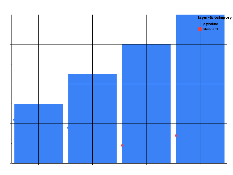
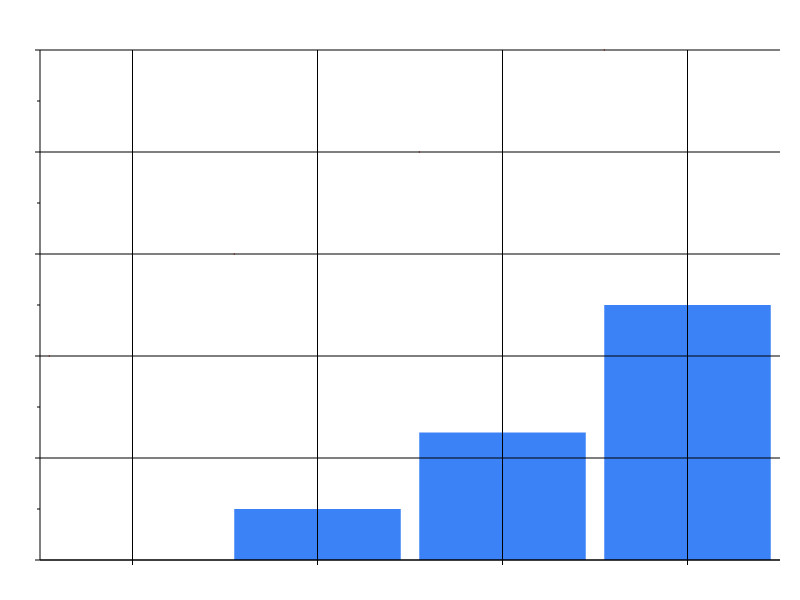
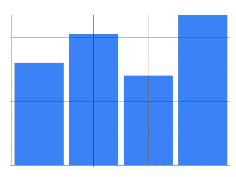
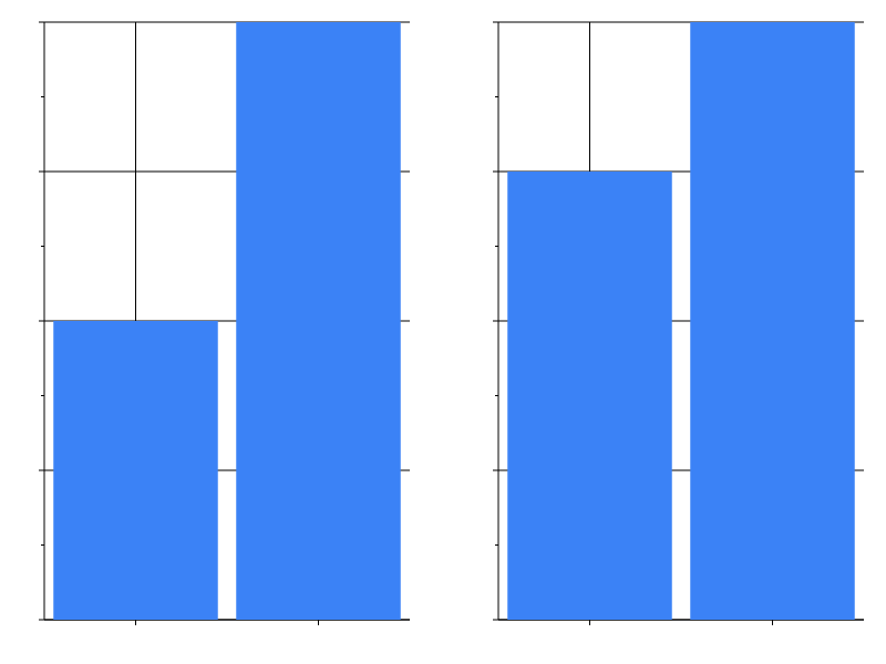
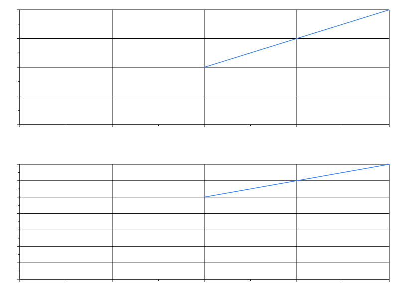
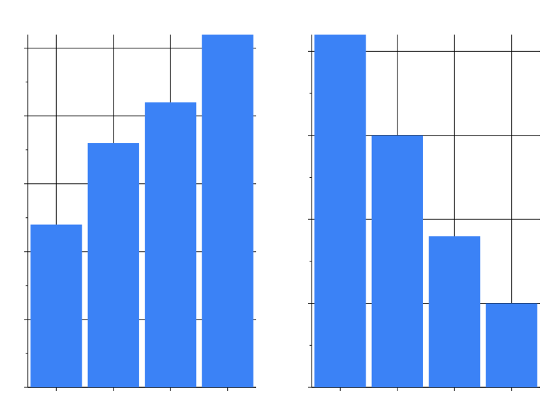
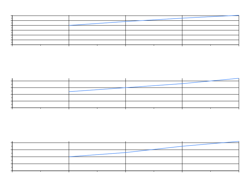
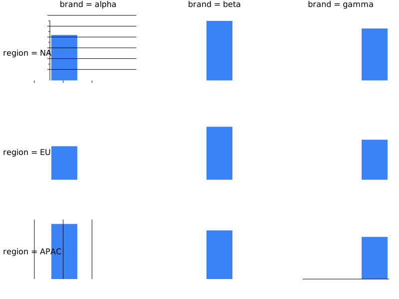
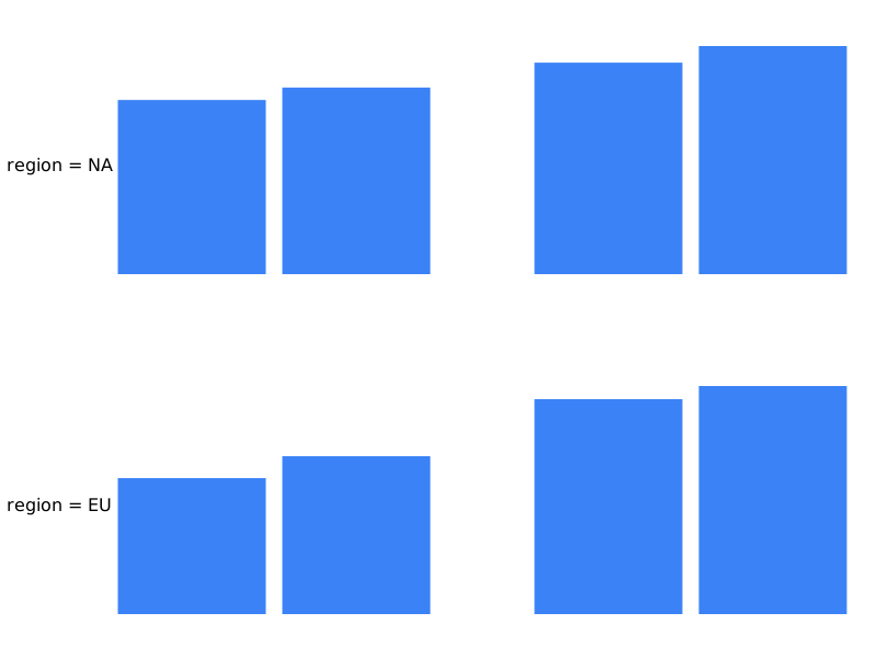
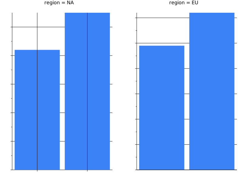
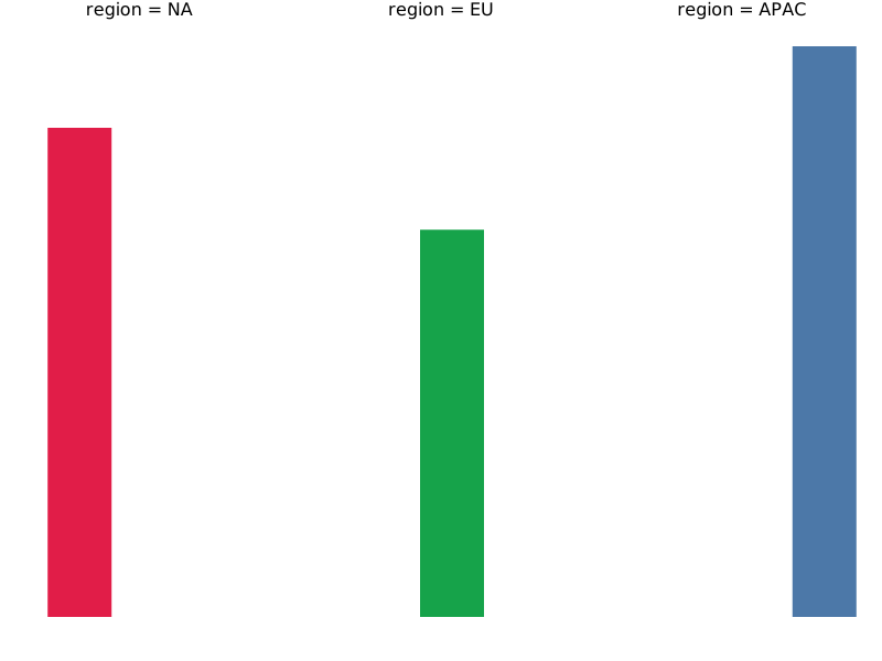
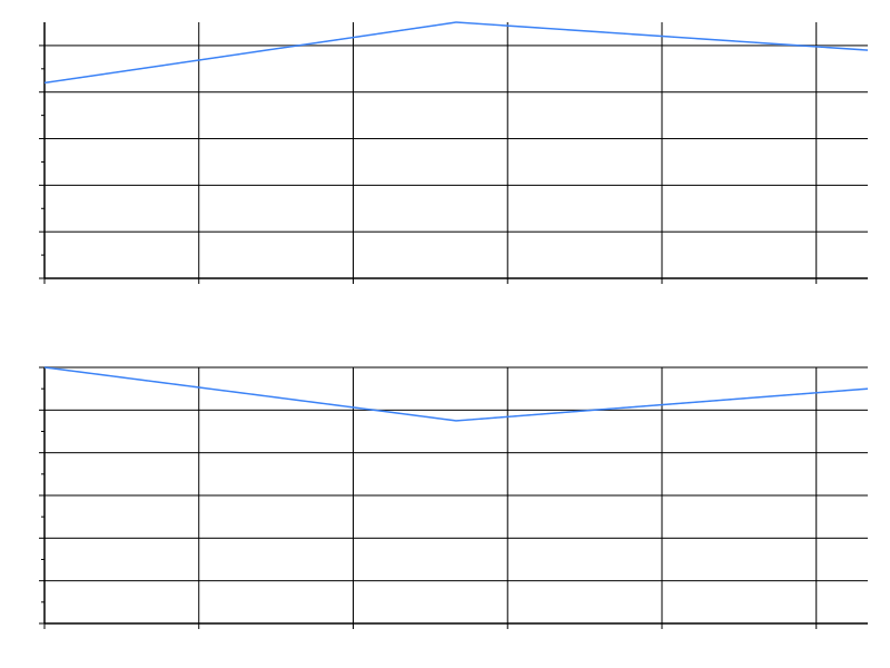
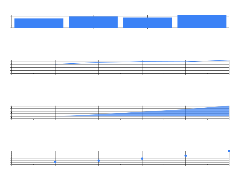
Multi-source
| Spec | Preview |
|---|---|
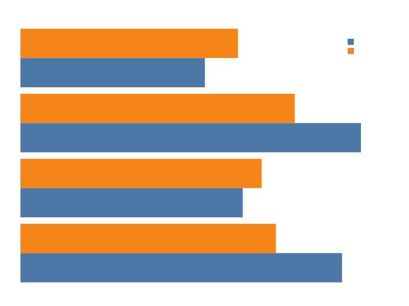
| actual_vs_benchmark | 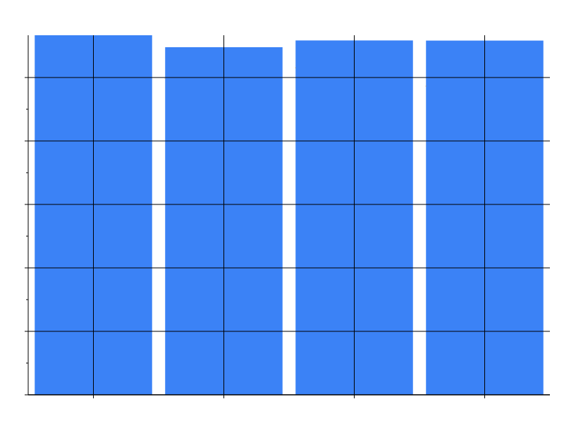 |
| multi_source_join | 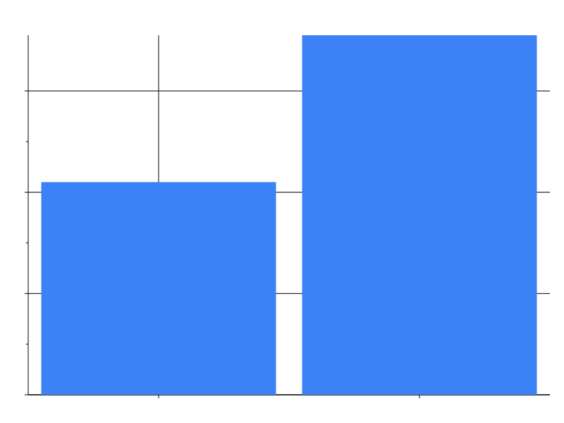 |
| bar_inline | 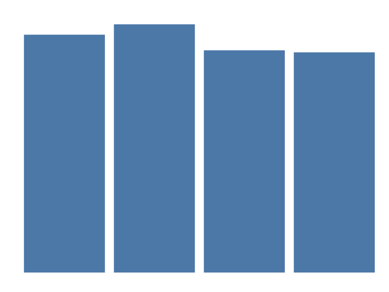 |
Transforms
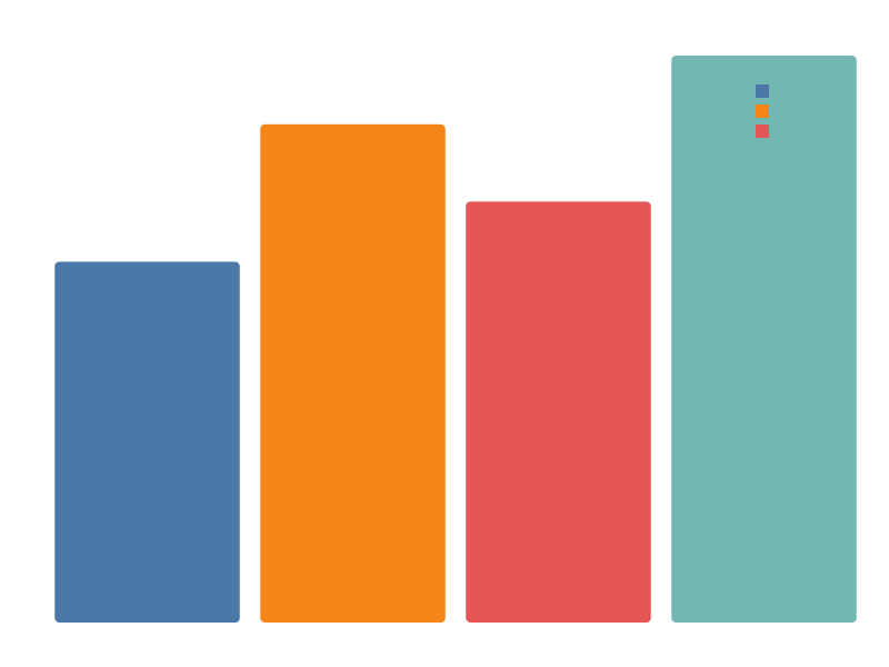
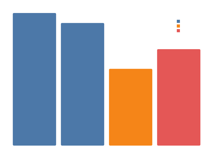
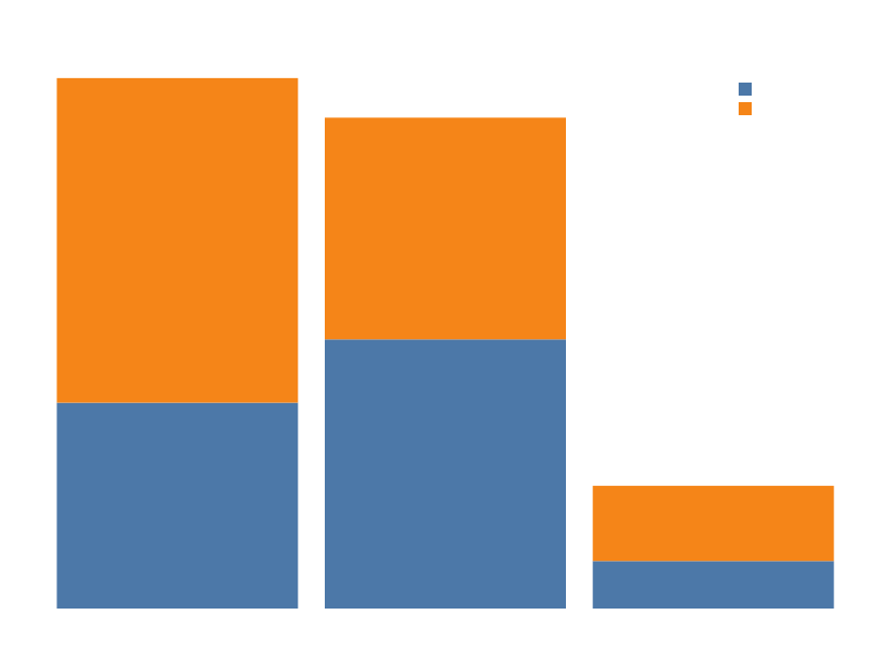
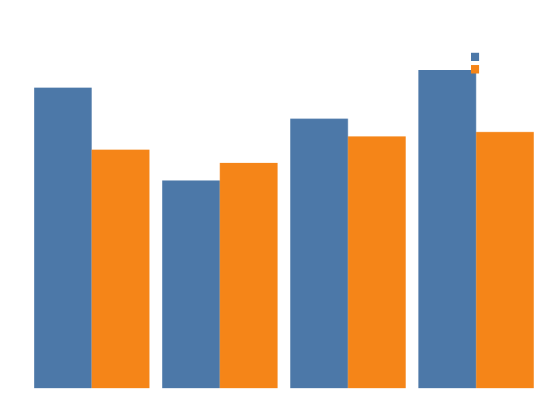
Scales
| Spec | Preview |
|---|---|
| linear | 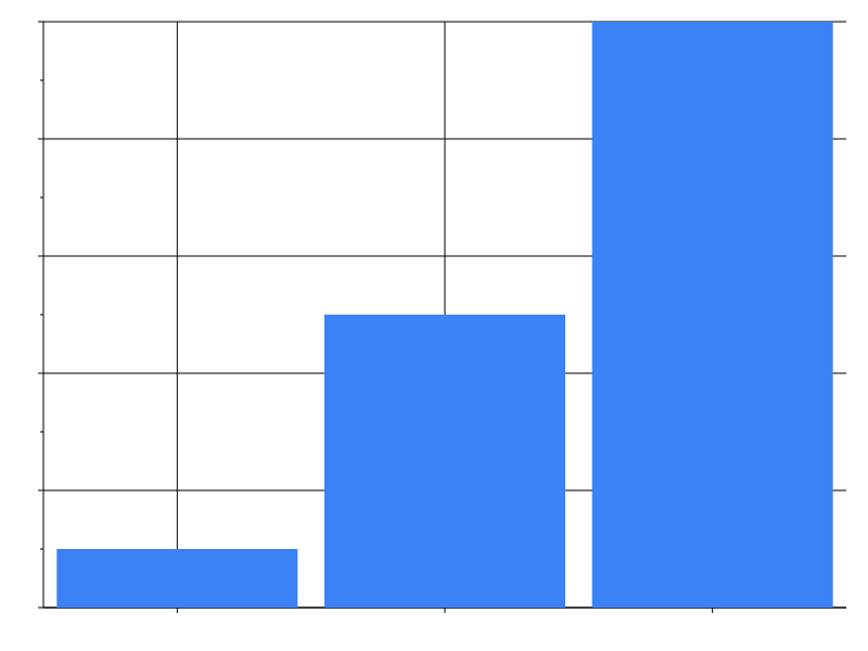 |
| log | 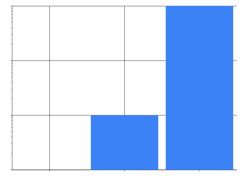 |
| log_revenue | 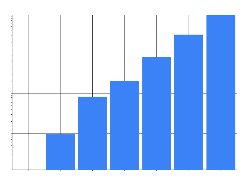 |
| pow | 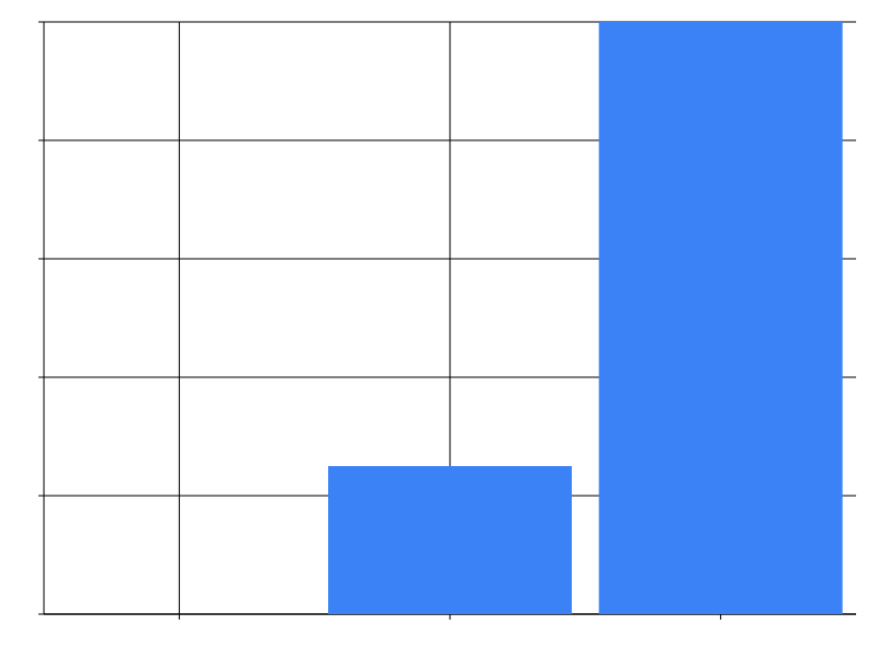 |
| sqrt | 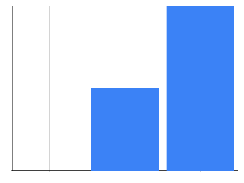 |
| time | 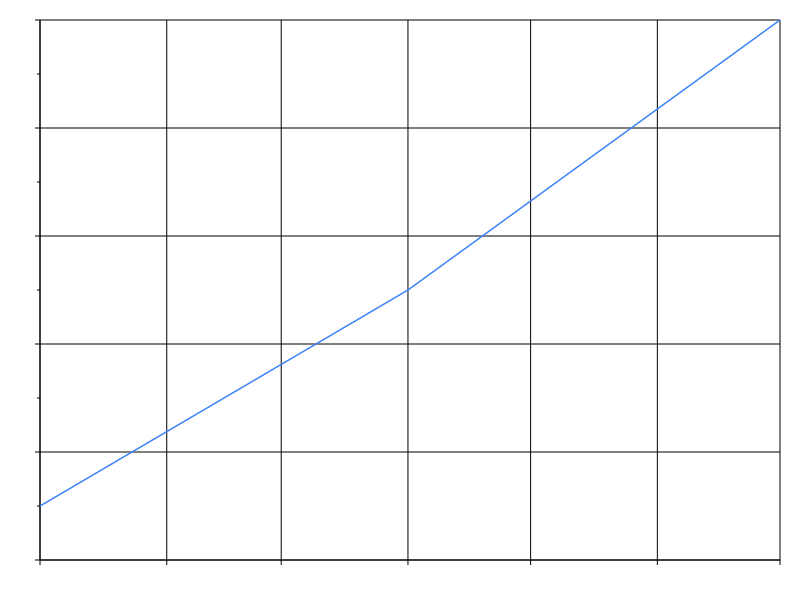 |
| band | 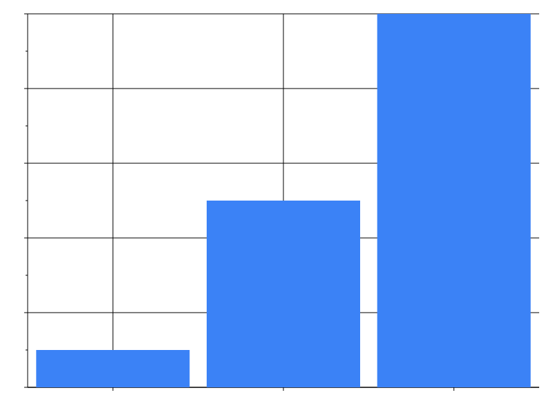 |
| point | 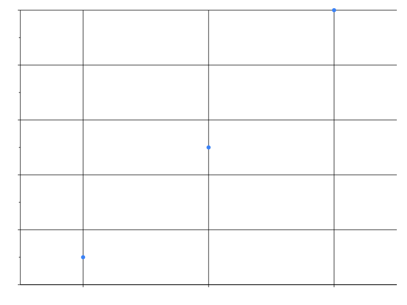 |
| ordinal | 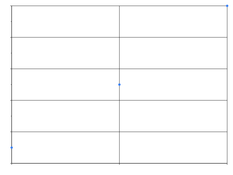 |
| axis_tick_values | 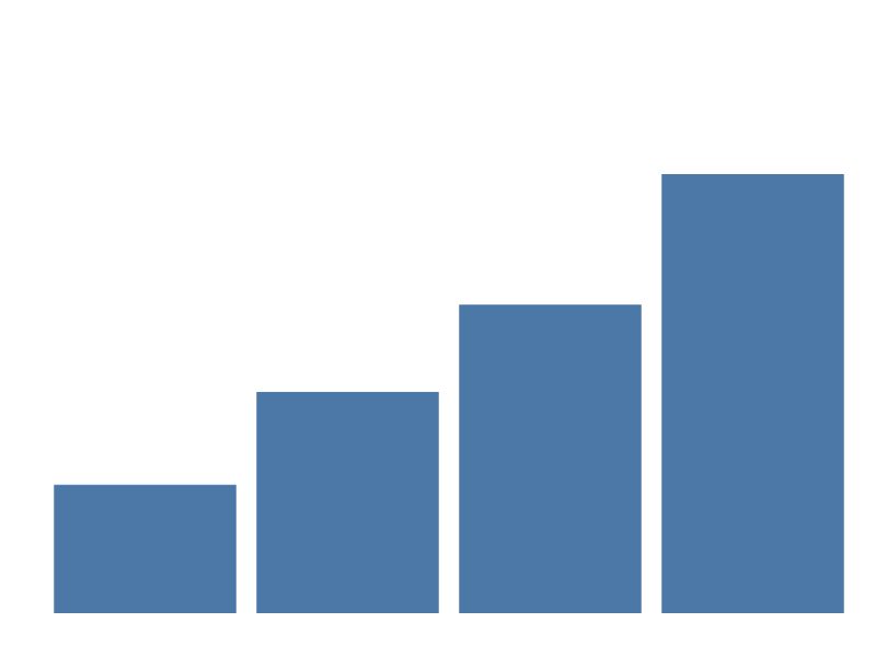 |
Axes
| Spec | Preview |
|---|---|
| axis_orient_top | 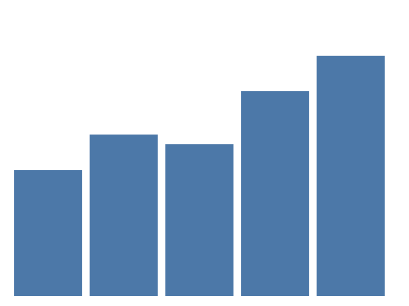 |
| axis_orient_layer | 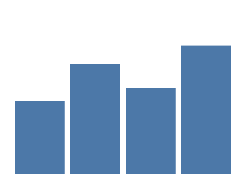 |
Legends
Everything the legend block controls — content (title, values,
label_limit), layout (orient, direction, symbol_type,
symbol_size), and the gradient legend a continuous colour channel
builds. See Encoding ›
Legends.
| Spec | Preview |
|---|---|
| legend_content | 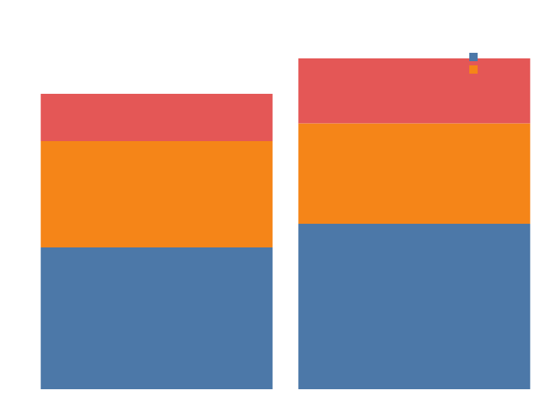 |
| legend_layout | 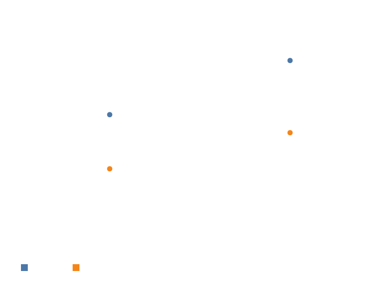 |
| legend_gradient |  |
Selections
| Spec | Preview |
|---|---|
| selection_point | 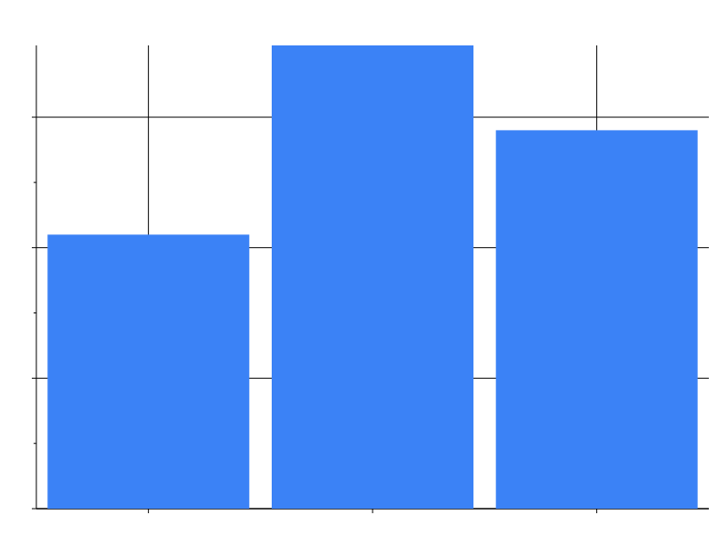 |
| selection_interval | 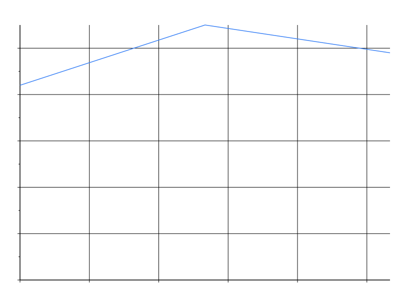 |
| selection_point_bar | 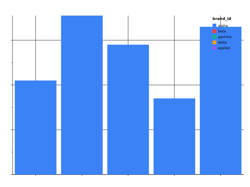 |
| selection_interval_brush | 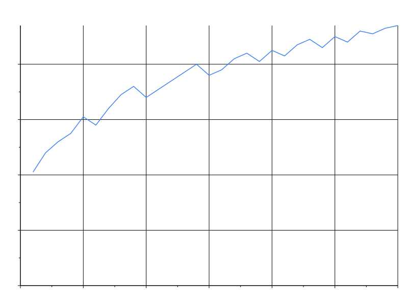 |
| selection_cross_chart_overview | 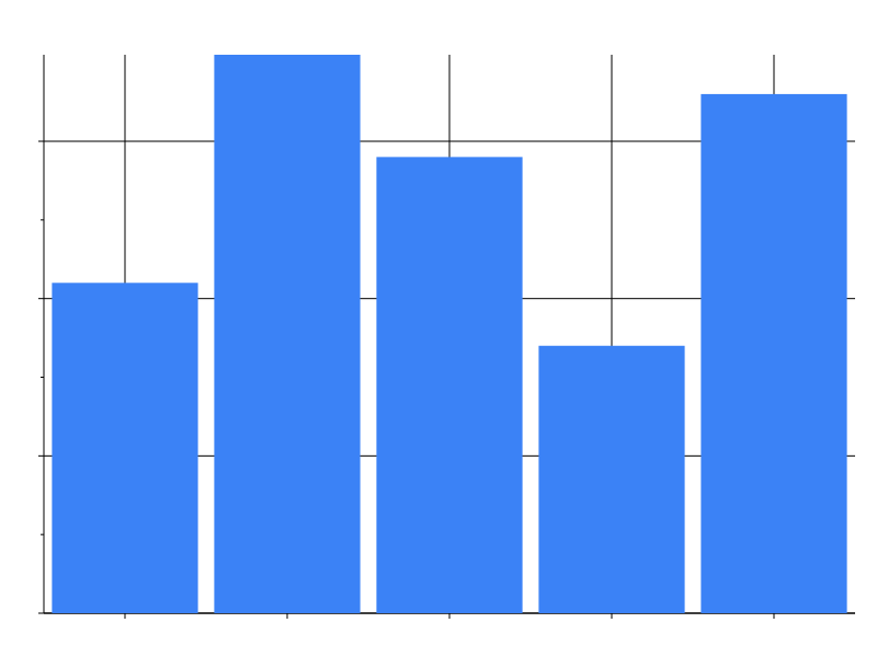 |
| selection_cross_chart_detail | 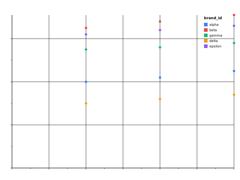 |
Conditions
Per-channel condition clauses switch a channel’s value based on a
selection or a structured predicate test. See
Encoding › Conditions.
| Spec | Preview |
|---|---|
| brush_highlight | 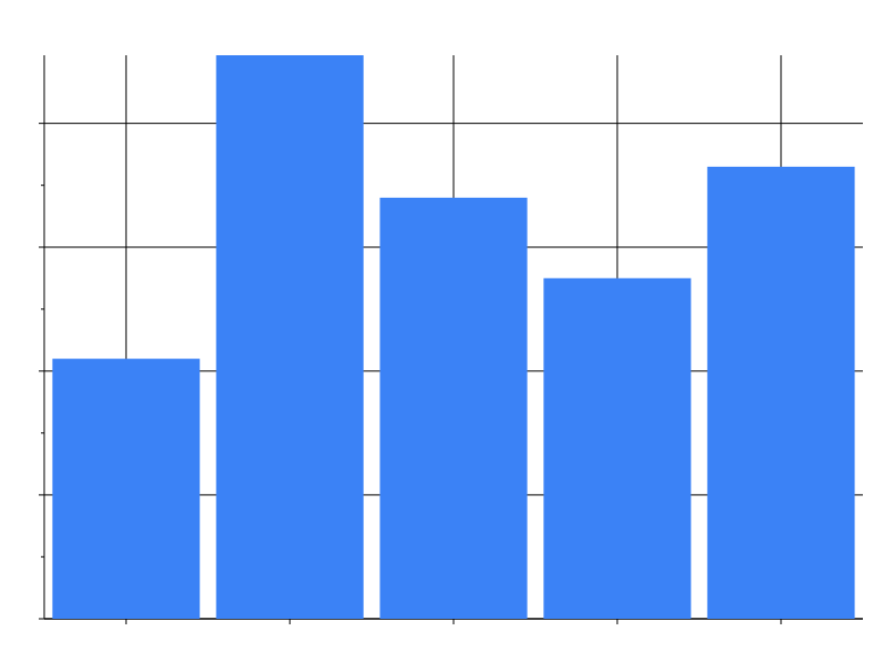 |
| test_predicate | 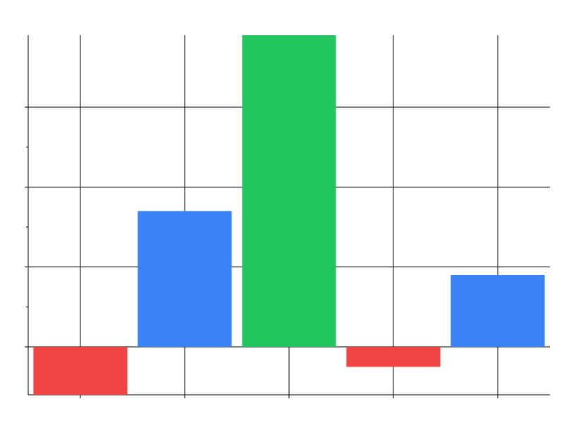 |
Tree
Rooted hierarchies laid out with tidy-tree, plus the dendrogram
variant (step links, hidden nodes). All three bind the text channel
to label their nodes. See
Marks › Tree / dendrogram / network.
| Spec | Preview |
|---|---|
| org_chart | 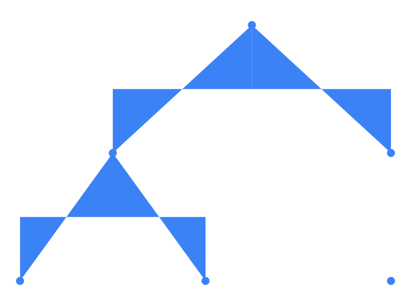 |
| decision_tree | 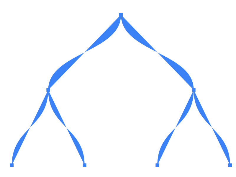 |
| cluster_dendrogram | 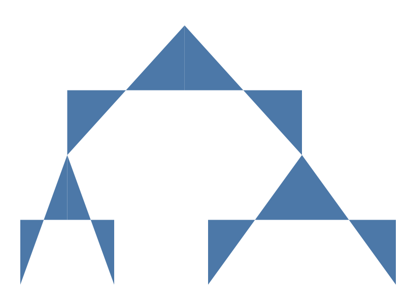 |
Network
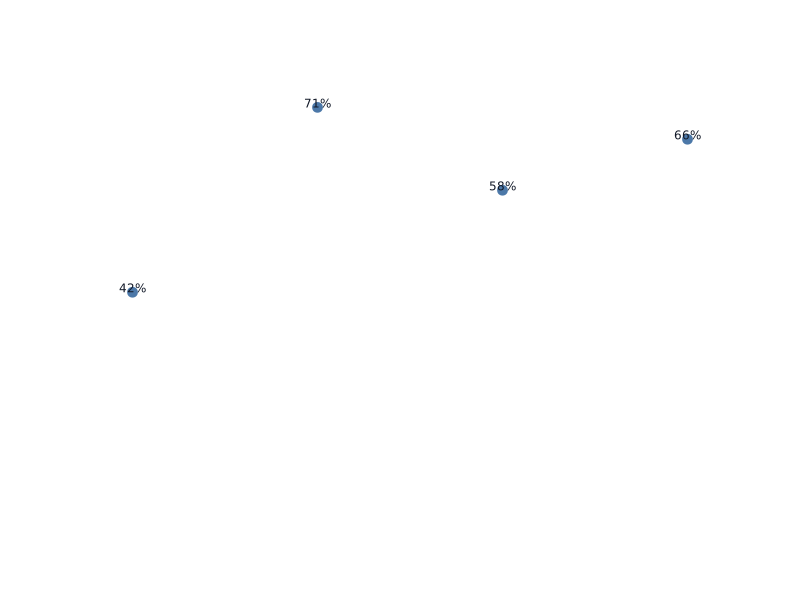
Force-directed node-link diagrams with deterministic seeded layouts.
Bind the text channel to label the nodes.
See Marks › Tree / dendrogram / network.
| Spec | Preview |
|---|---|
| citation_network |  |
| dependency_graph |  |
| labelled_network | 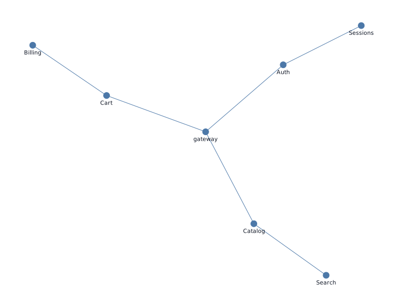 |
Themes
Themes are applied via the --theme CLI flag at plot time. Each spec
below is identical; only the rendering theme differs.
| Spec | Preview |
|---|---|
| bar_light | 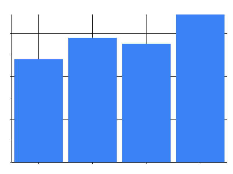 |
| bar_dark | 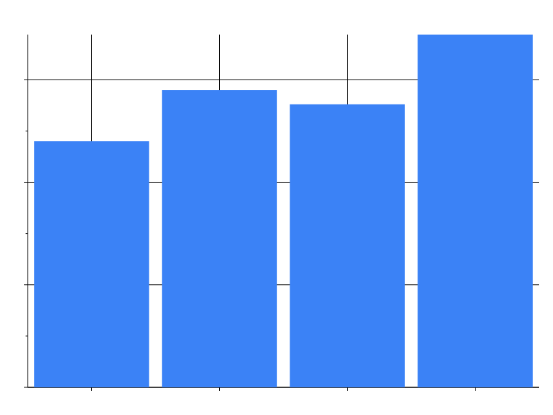 |
| bar_print | 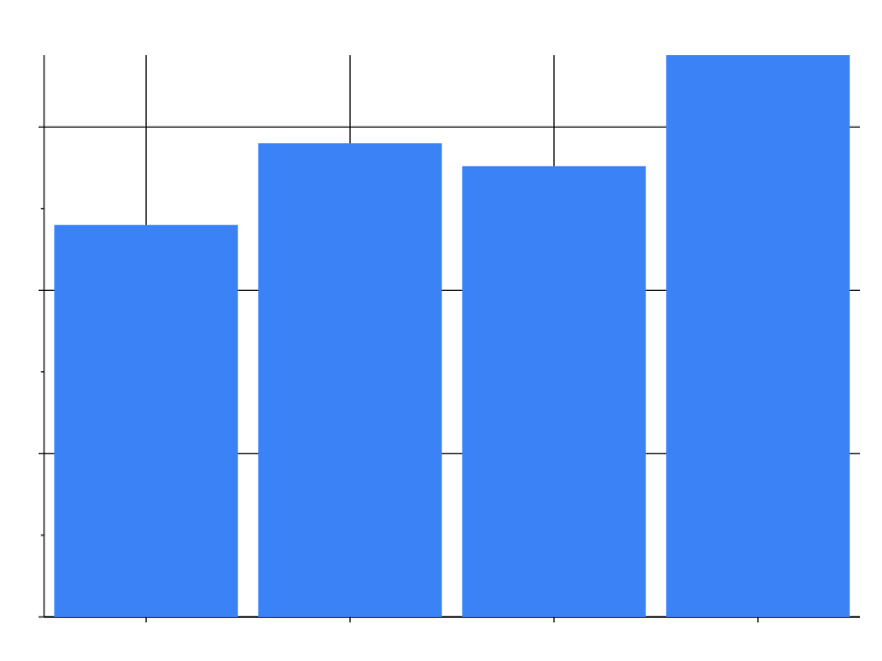 |
| bar_high_contrast |  |
| bar_colorblind |  |
| bar_filter |  |
| bar_gradient |  |
| bar_pattern | 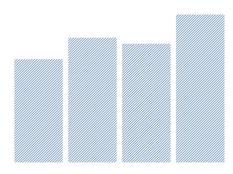 |
| bar_dark_variant | 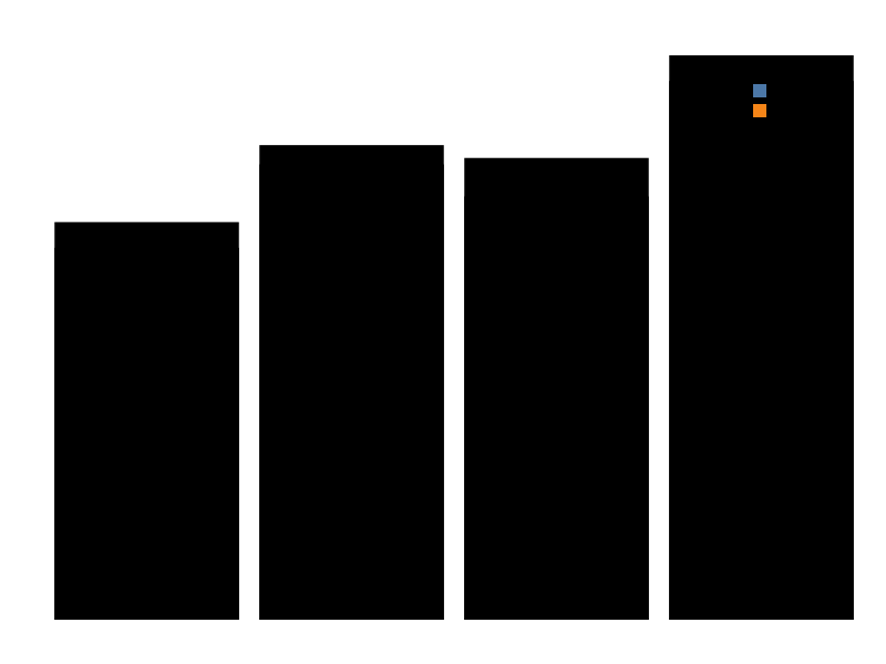 |
| bar_category_styles |  |
| bar_per_axis_grid | 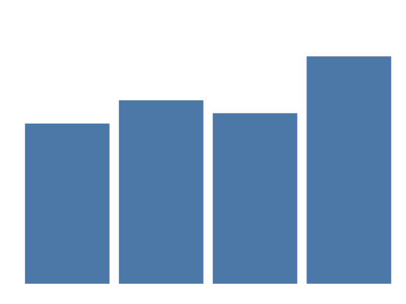 |
bar_dark_variant is different from the row above it: its spec sets
theme: {"dark_variant": "dark"} instead of picking a theme with
--theme, so the one rendered SVG embeds both the light and dark
palettes and switches between them via @media (prefers-color-scheme: dark) — see Dark variant
pairing. The static
preview above can only show the light rendering (the one your browser
is currently in), so verify the effect one of two ways:
- Toggle your OS or browser dark-mode setting while viewing the
<img>above (or open the raw SVG directly) — the axes, grid, legend, and bar colors all swap without a re-render. - View source on
themes/bar_dark_variant.svgand look for the@media (prefers-color-scheme: dark)block inside the<style>element, plusfill="var(--prism-resolved-N)"on the<rect>elements — those are the doubled CSS custom properties described in the docs.
bar_category_styles demonstrates theme.category_styles: the theme
maps each quarter value to its own MarkStyle (Q1/Q2/Q3/Q4
each get a distinct fill), and every bar picks up its category’s
color automatically — no spec-level condition block at all. See
Category styles for the
field→value→style shape and how a spec-level condition on the same
field/value would win if one were present.
bar_per_axis_grid demonstrates theme.axis_x / theme.axis_y: the
shared axis block sets one grid colour, then each per-axis block
overrides it for one orientation only — the vertical grid lines (drawn
by the x axis) become dashed amber, the horizontal ones (drawn by
the y axis) stay slate. It also exercises the axis-title gap: the
y channel’s spec-level axis.title_padding outranks the
axis_y.title_padding the theme asks for, while the x axis, which
nobody configures, keeps the built-in 8 px. See Per-axis
blocks and Axis geometry
precedence.
Animation
Each spec declares an animation block plus a key: true channel; the
SVG previews show the initial frame. The tween fires in the browser
web component / WASM runtime when the spec swaps or a new dataset
arrives — see Spec › Animation and
Browser › Animation.